


Struggling to find the right colour palette for your house? Or perhaps you need some decorating inspiration to help sell a property? We take a look at some of the most the popular paint colours for each room
 While many people are taking advantage of the stamp duty holiday and moving house, others are remortgaging or taking out secured loans to make a bit of extra cash to renovate their current home.
But whether you are decorating to make a good impression on sellers or looking for a way to freshen up your new or existing home, it’s likely you have faced the paint colour conundrum.
It can be quite problematic deciding how your room might look when all you have is a paint sample card and a Pinterest board.
So, to help you whittle down your choices, regulated property buyers GoodMove have offered their advice on choosing colours which will last in each room. It has analysed Google search data to find the most popular shades.
What’s more, they have also offered their guidance on the colours which won’t work and might actually cause you a headache in years to come.
Nima Ghasri, director at Good Move, says: “Choosing the right colours in your home can be difficult, but it doesn’t need to be.
“Choosing colours that are perfect for the space will ensure they will stand the test of time, so you won’t become bored or unhappy with the space and look to redecorate too soon. Hopefully, these tips will help you choose colours that are bound to last.”
Kitchen
Choose: Yellow
Avoid: Black/charcoal
This will make your kitchen pop, says GoodMove. In fact, Yellow is a great option for smaller kitchens as it can make rooms feel bigger and brighter, and yellow tones can also make people feel happier and calmer while in the space.
Online searches for ‘yellow kitchens’ have increased by 132% in the past year, demonstrating how popular yellow kitchens are at the moment. GoodMove suggests choosing a high or semi-gloss finish paint as this is the most durable and easy to clean.
Dark colours, meanwhile, such as black or charcoal can make the space feel gloomy and small – the opposite of what a kitchen should be so avoid if possible.
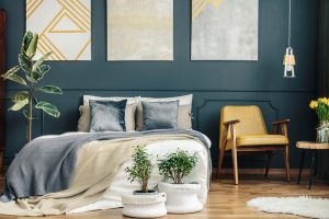
Bedroom
Choose: Navy
Avoid: Bright red/orange
Deep blues and navy wall colours will stand the test of time and also look amazing. These deep hues provide a sense of serenity and relaxation – perfect for a bedroom – and can help create a cosy environment too.
Navy bedrooms are also hugely popular, with searches up 245% compared with this time last year.
Loud bright colours, such as reds or oranges, should be avoided as as these are too stimulating for a room where you need to switch off and sleep.
Living Room
Choose: Green
Avoid: Bright red
Online searches for ‘green living rooms’ were up 94% compared to October 2019. GoodMove said green is the colour of harmony and renewal. Apparently it helps to emit feelings of calm and relaxation – perfect for your living room for years to come.
Your living room is ultimately a room to relax after a long day, so avoid intense reds as this is far too stimulating and bright for the space.
Dining Room
Choose: Orange
Avoid: Blue
 Orange tones, it is said, are meant to increase a person’s appetite – making them an ideal choice for the dining room.
They also make a space feel warm and cosy too. GoodMove said Google searches for ‘orange dining rooms’ are up 83% compared to last year.
Since orange is quite bold – if you are nervous about using it, why not try painting it on one side of the room only and creating an ‘accent wall’.
While orange increases appetite, blue suppresses it, so avoid any blue tones in your dining room if you want to eat there.
Bathroom
Choose: Light blue
Avoid: Dark colours
Light blue has always been a popular bathroom colour as it helps to create a relaxing, peaceful, and spa-like atmosphere.
It’s no wonder then that searches for ‘light blue bathroom’ increased by a 614% compared to this time last year. GoodMove said this showed there were no signs of going out of style anytime soon.
Try to avoid extremely dark colours in your bathroom, especially if it’s small, as this will only make the space seem cramped and unrelaxing.
Study
Choose: Red
Avoid: Neutrals
Working from home has become the normal for many employees because of social distancing and government restrictions. If you are lucky enough to have an office space at home, experts advise red is the colour to paint the room.
It’s a stimulating shade that helps improve focus, alertness, and concentration – making it ideal for a study. Searches for ‘red study’ have increased 400% since October 2019, proving its popularity.
Avoid sole neutral tones in your study as these can be uninspiring and can make you feel bored or sleepy – not ideal for a study space!
[box style=”4″]
We have teamed up with Loans Warehouse, the UK’s leading second mortgage broker, to help you find the best secured loan deal.
To view the Best Buy Second Mortgages currently available click here.
[/box]